TACTICAL TECH STUDIOS / ANTI SLAVERY INTERNATIONAL
Visualising modern slavery practices
ABOUT TACTICAL TECH
Established in 2003, Tactical Tech is an international NGO working to enable the effective use of information for progressive social change. Their mission is to advance the skills, tools and techniques of rights advocates, empowering them to use information and communications to help marginalised communities understand and effect progressive social, environmental and political change.
ABOUT THE PROJECT
An old project, done way back in 2010 ; but one I am proud of. Products of Slavery is a data visualisation website about forced labour and child labour, also known as modern slavery, in the supply chain of many consumer goods. The raw data for this visualisation comes from a 194-page report with over 2000 references written by the United States Department of Labor about products manufactured using forced labour.
The main aim of this project was to turn this data and its sources into something that quickly shows the impact and scale of modern slavery in supply chains, whilst enabling visitors to dig deep if they want to.
My Role
This project was commissioned to us (Mediashala) by Tactical Tech Collective and Anti-Slavery international. It formed the main part of a campaign by Anti-Slavery International against forced and child labour in supply chains, launched on Anti-Slavery Day.
I was a couple of years into the beginning of my design career. In this project, my role was to figure out a fitting architecture, representation and interactions to make the provided data create an impact to the audience. After UI design, I also coded the entire application in Flash Actionscript ( yes ! it existed back then)
RECOGNITION
This interactive visualisation has received widespread recognition with over 380,000 visits and thousands of tweets. It was well reviewed in The LA Times, CNN, Fast Company, Le Figaro and Der Zeit.
"Visualization x Storytelling + Interactivity = GREAT eLearning! ....Here is a site that will take your breath away, both by how the elegant simplicity and combinations of elements creates impactful learning, and by the powerful data it brings to life."
-Williams Instructional Design Blog
“This aesthetically perfect and functional interactive is an absolute must to navigate and explore. ...It is rich with information and easy to process. It is a resource that has collected important data. It is enlightening or alarming, depending on your perspective. It’s really nicely put together...The icon graphics are nice. The interactivity is seamless. The data is clear. The options for varied viewing create a non-frustrating user experience.”
“Is there slavery in your chocolate? Or your sugar?Check out Anti-Slavery Inter-national©s well-designed website—and the accompanying poster (PDF)—for a simple illustration of the wide range of products that are produced around the world at the hands of forced laborers.”
EXPLORING THE VISUALISATION
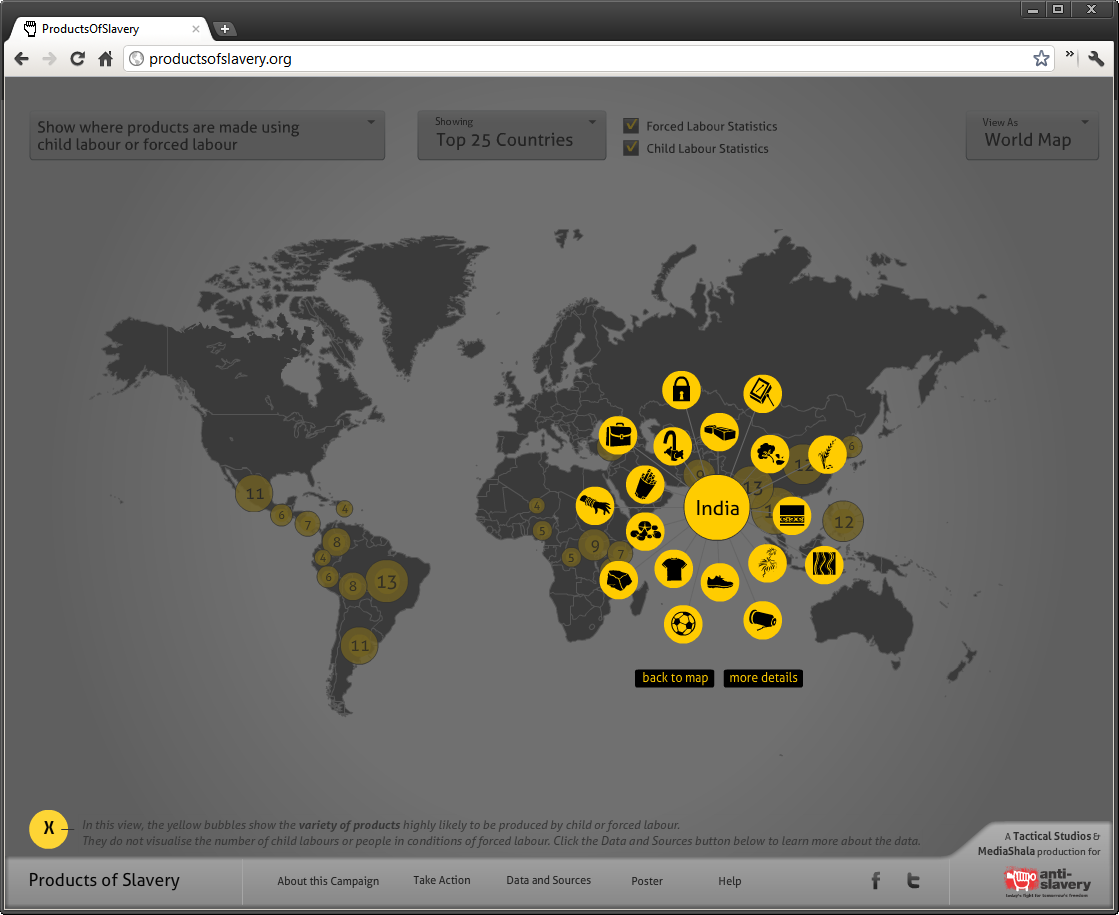
Map and Graph View
Visitors can explore the visualisation from perspectives; for example a graph / sorted view of the list of countries where practices of modern slavery are most common to least common

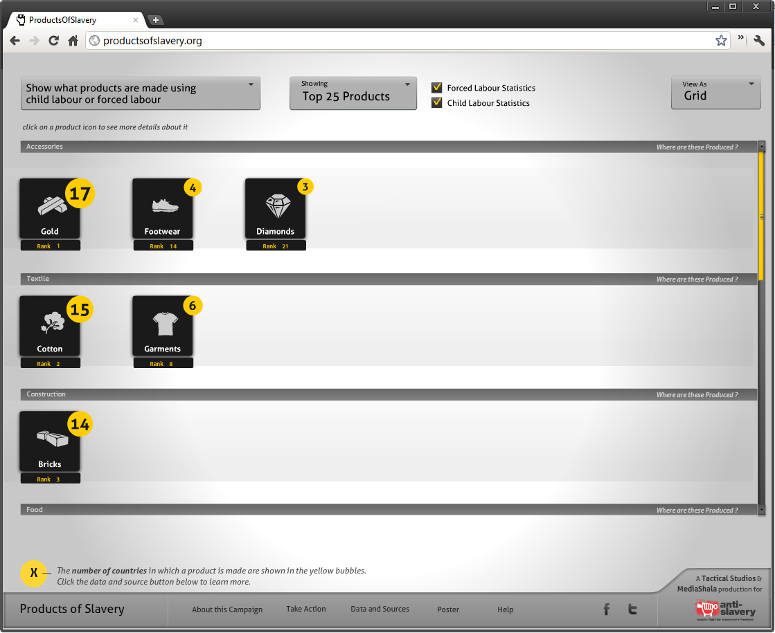
Products point of view
A sorted list of products that involve modern slavery practices -forced labor, child labor or both
Product Details and Country Details
Detailed views of each product (and where are they are manufactured by unfair means) and each country (and what products in that country are manufactured by unfair means) provide two different perspectives to the user. Accompanying these visualiations are facts sourced from various reports which make the impact more powerful.

